
I’m sharing some of the beautiful rooms I toured during my recent visit to the Pasadena Showcase House of Design in California.
I attended the showcase home a few years ago and became enthralled with this spectacular tour.
First of all, Pasadena is such a gorgeous city, just driving the streets and looking at the charming homes is fun for me. Secondly, these designers really bring their A-game and everything is just stunning.
Take a look at some of the downstairs spaces in this post today. I’ll post the upstairs in my next post.
The home is a Tudor style and has lots of rooms, perfect for a showhouse with a designer for each room. There is much to see!
By the way, most of my pics are rather close-up, as there were lots of people in the house and really, you should all go visit in person if you can. :-)

Pasadena Showcase House of Design
Grand Entry And Upstairs Gallery
The entry hall had a lovely central hall table with a pretty chandelier and wallcovering on the ceiling between the beams. (Hint, you will see a lot of wallcovering in this showhouse! :-)
The entire space was treated in black, white and gold to highlight the spectacular original stained glass windows on the second floor.
This space is designed by Pamela Sandall Design.
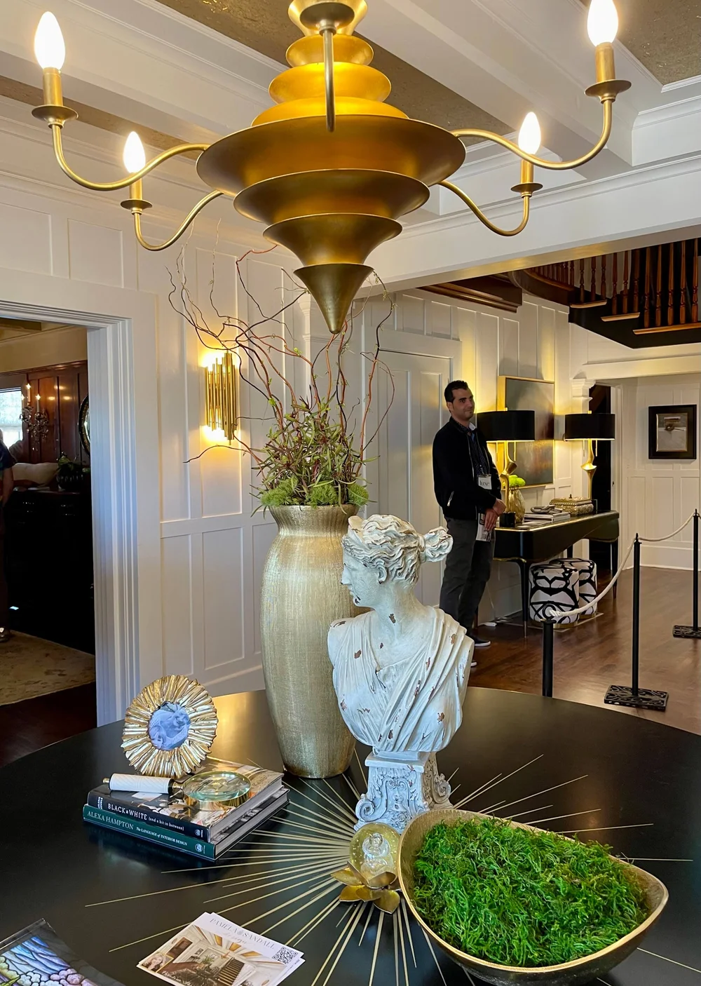
Grand entry and upstairs gallery designed by Pamela Sandall Design. Pasadena Showcase House of Design
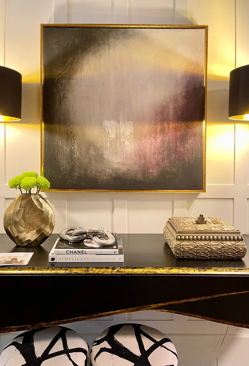
Grand entry and upstairs gallery designed by Pamela Sandall Design. Pasadena Showcase House of Design

Stained glass window in the Pasadena Showcase House of Design
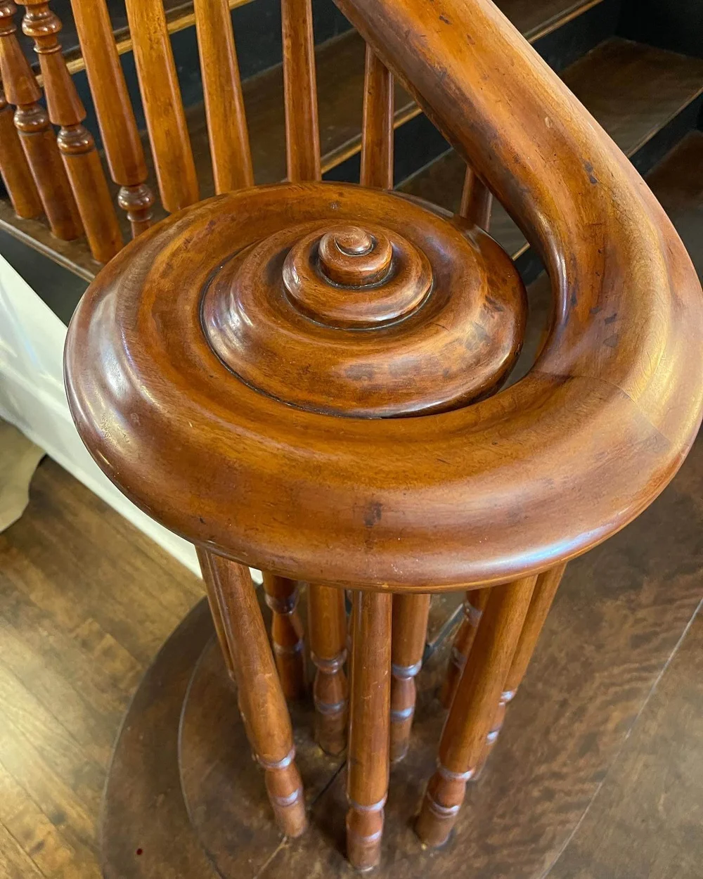
Stair details of the Pasadena Showcase House of Design
Living Room
The living room, designed by Robert Frank Interiors, was so calm and relaxing but very chic. The wood in this room was previously all dark and it was lacquered white to give a fresh and contemporary appeal. I loved the beautiful art in this space and so appreciate the restraint in this room.
This designer could design a home for me and I would feel absolutely comfortable handing over the reigns and having him call me when it was done. (And I don’t say that about anyone!)

Living room designed by Robert Frank Interiors, Pasadena Showcase House of Design

Love the gorgeous spot of color in this stool at the fireplace. Living room designed by Robert Frank Interiors, Pasadena Showcase House of Design.
Powder Room
The powder room under the stairs was a little jewel of a space, designed by Gwen Sukeena, Sukeena Homes. The most delicate, feminine hand painted ceiling feature captured attention here within this dark and more masculine space. It was such a beauty!

Ceiling feature in the powder room, designed by Gwen Sukeena, Sukeena Homes. Pasadena Showcase House of Design
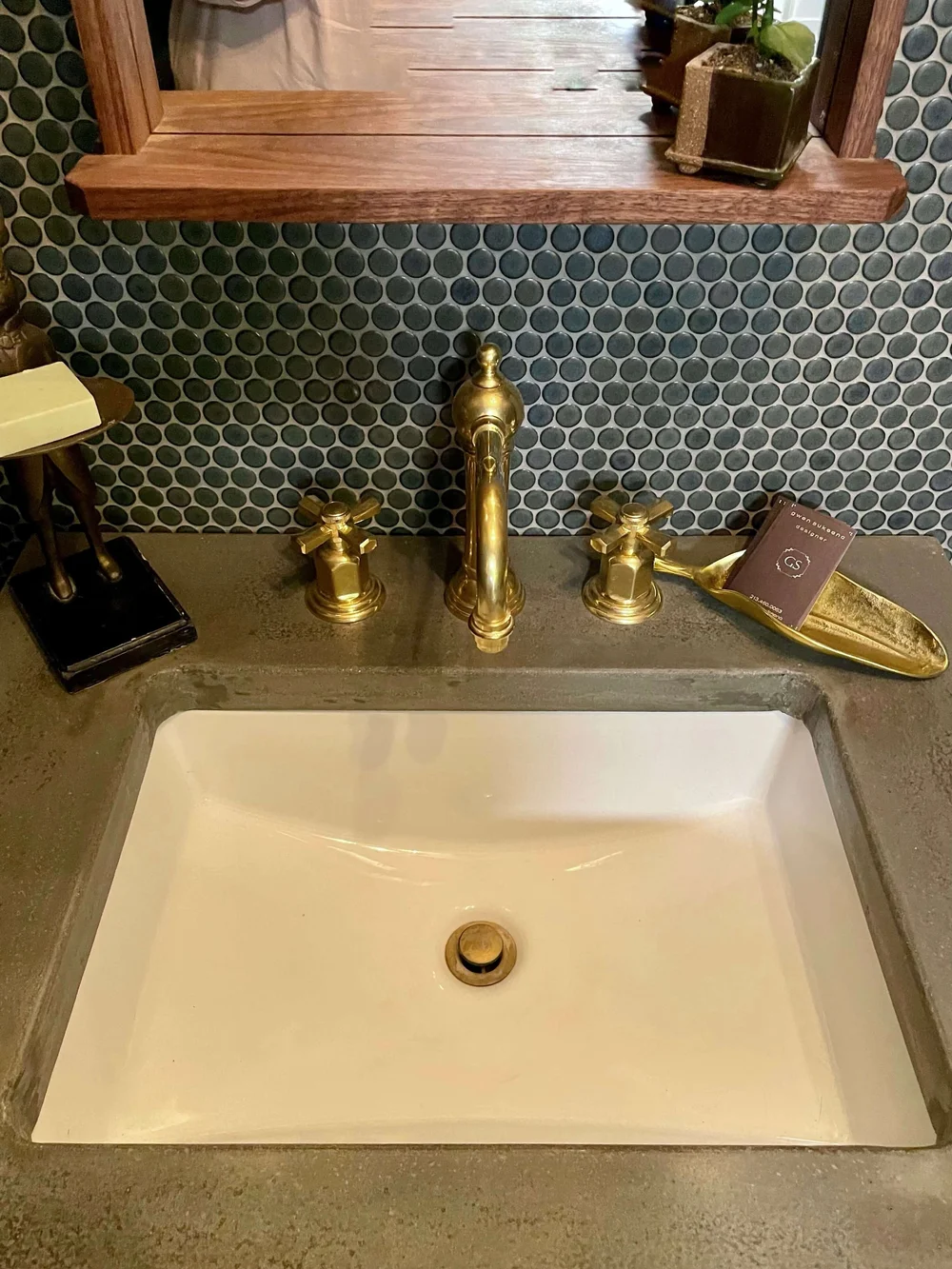
Powder room, designed by Gwen Sukeena, Sukeena Homes. Pasadena Showcase House of Design
Library
What a handsome library this was with lots of special details! Wallcovering on the ceiling and in the backs of the bookcases made for such a luxurious look.
This space was designed by Stephanie Hatten of SH Interiors and besides books, featured a dramatic colorful sofa and a beautiful bar with bistro shelving. All such nice custom touches that combined beautifully.
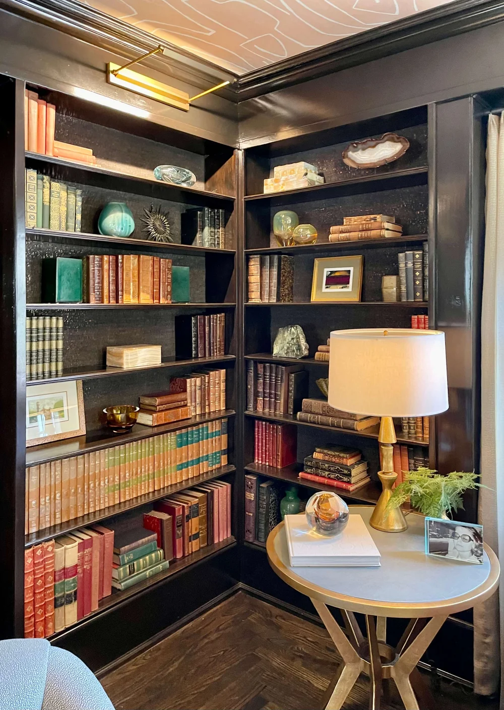
Library designed by Stephanie Hatten of SH Interiors with wallcoverings on ceiling and backs of bookcases. Pasadena Showcase House of Design
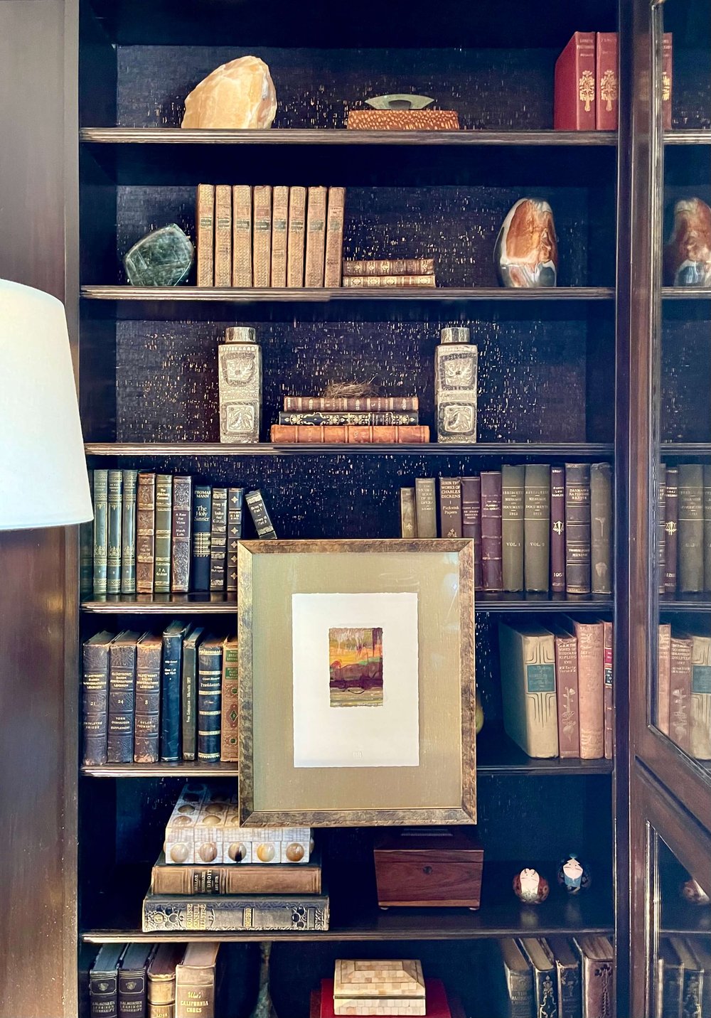
Library designed by Stephanie Hatten of SH Interiors with wallcoverings on ceiling and backs of bookcases. Pasadena Showcase House of Design

This striking colorful sofa brought some drama to this room. Library designed by Stephanie Hatten of SH Interiors, Pasadena Showcase House of Design.

The wallpapered ceiling showed a beautiful attention to detail. Library designed by Stephanie Hatten of SH Interiors, Pasadena Showcase House of Design.
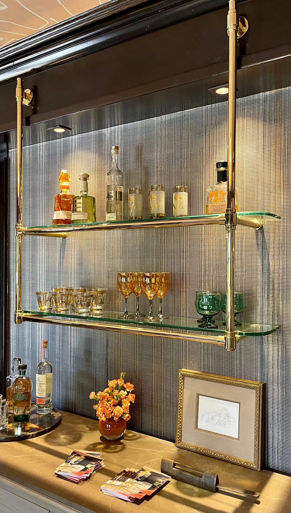
Bistro shelving at the bar in the library add some glam to this space. Library designed by Stephanie Hatten of SH Interiors, Pasadena Showcase House of Design.
Family Room
The family room, designed by Tocco Finale Home, was a larger room and also had many custom details. There was a comfy sectional in the room facing a tv, but also other seating groups in the beautiful window nooks of this space.
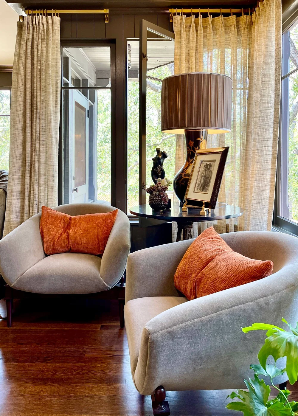
Comfy chairs in a corner of the family room looked inviting with their spot of color. Family room designed by Tocco Finale Home, Pasadena Showcase House of Design.
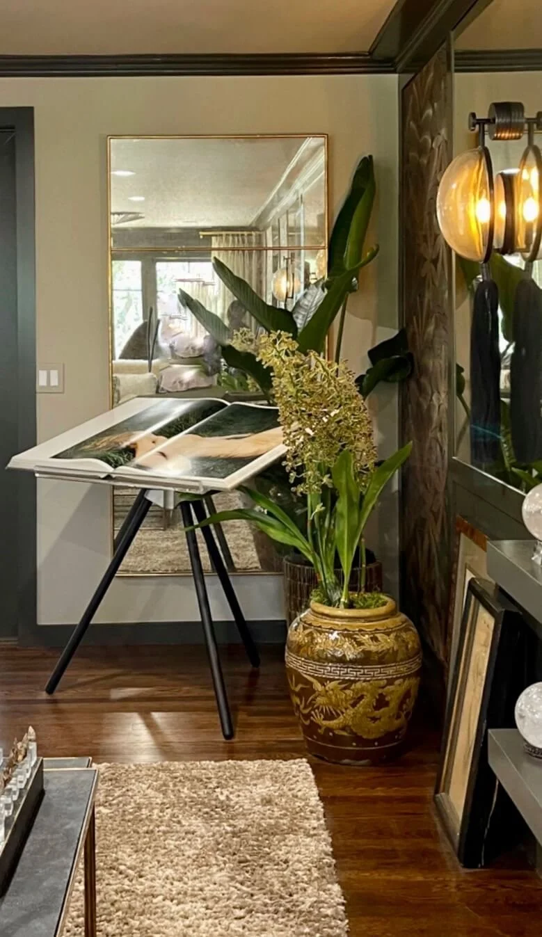
Loved this unusual book stand in the corner of this space. I always love a mirror across from a window for bringing in all that light! Family room designed by Tocco Finale Home, Pasadena Showcase House of Design.
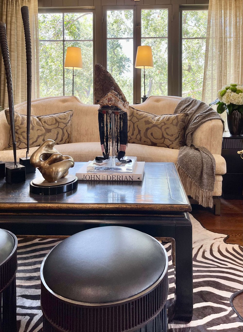
Here’s another seating group at the windows. What a perfect room for entertaining! Family room designed by Tocco Finale Home, Pasadena Showcase House of Design.
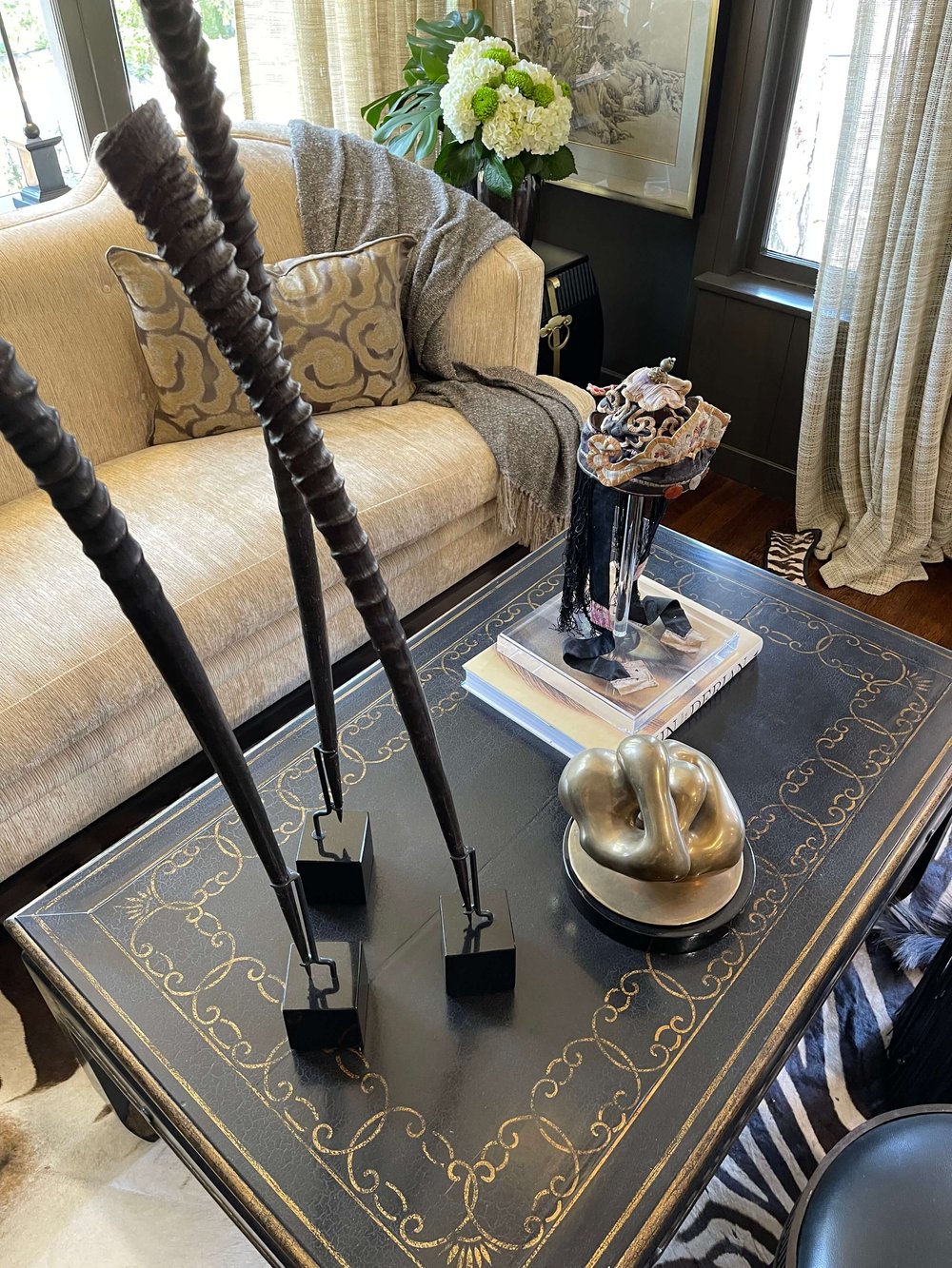
Clever coffee table styling from Tocco Finale Home, Pasadena Showcase House of Design.

This was a spectacular cabinet in the family room, designed by Tocco Finale Home, Pasadena Showcase House of Design.
sunRoom
The sunroom was such a bright spot on this tour with the perfect place for your morning coffee or a refreshing iced tea in the afternoon. The lush greenery outside that charming leaded glass window flowed into this room for a seamless feel.
This room was designed by James Hernandez Interior Design.

The green fractured geometric really plays with the vintage diamond window nicely. Sunroom designed by James Hernandez Interior Design, Pasadena Showcase House of Design.

The art adds a vibrant note in this sunroom designed by James Hernandez Interior Design, Pasadena Showcase House of Design.
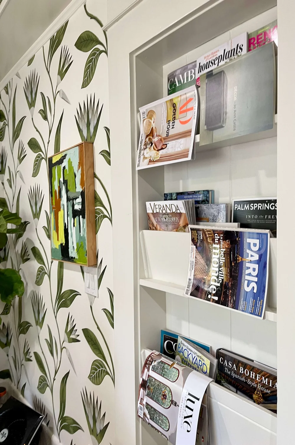
What handy storage for books and magazines! Sunroom designed by James Hernandez Interior Design, Pasadena Showcase House of Design.
Dining Room
I wish I could have gotten more pictures from a wider angle here, this room was crowded when we toured! The ceiling was a show-stopping feature, all handpainted panels between the beams to add color and art to the space.
I loved the use of majolica in this room, it spoke to the painted ceiling design in such an intentional way.
The dining room was designed by Louise O’Malley Interior Design.
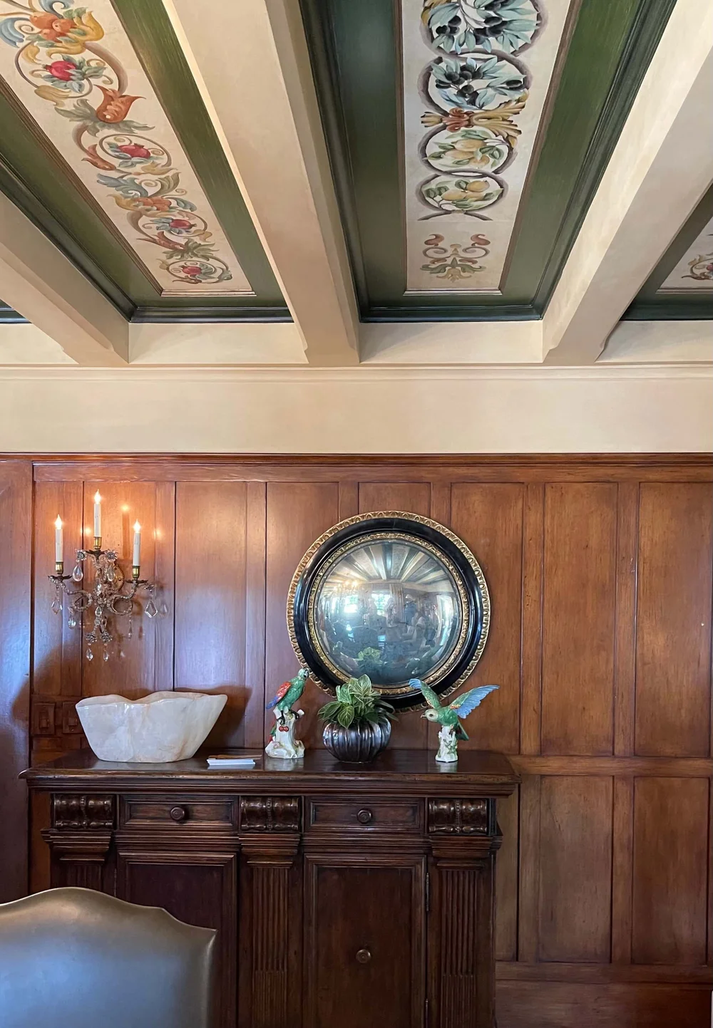
A decorative ceiling compliments the wood paneling in the dining room, designed by Louise O’Malley Interior Design, Pasadena Showcase House of Design.

The colorful majolica adds a touch of whimsy and repeats the colors in the ceiling of the dining room, designed by Louise O’Malley Interior Design. Pasadena Showcase House of Design.

Close-up detail of the painted ceiling design in the dining room, designed by Louise O’Malley Interior Design. Pasadena Showcase House of Design.
Fit Stop Gym and Bath
There were too many people in the home gym for a good pic, but it was definitely built for a workout. What a luxury to have dedicated rooms for all these daily activities and this room has a shower nearby too. The contemporary look is so smart and reminds us of other touches of black in this home.
The gym and bath were designed by Karen Billman Designs.
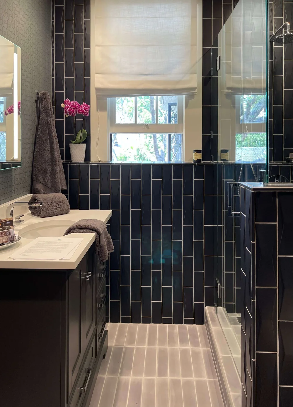
The contemporary Fit Stop Gym and bath, was designed by Karen Billman Designs. Pasadena Showcase House of Design.
Laundry Cafe
This cute room is multi-functional and has many unique features. Just by reading the name of this space you know it is going to take the drudgery out of laundry!
I loved the wallpaper, the hanging rack and the dark painted trim and cabinetry. It’s also outfitted with a coffee bar set up. Come in here for your morning cuppa and put on a load of washing. It certainly makes laundry much more fun.
This space was designed by Denise Bosley Interiors.

Clothes would dry in a minute hanging here on this cute rack by the window. Laundry room designed by Denise Bosley Interiors, Pasadena Showcase House of Design.

Laundry room designed by Denise Bosley Interiors, Pasadena Showcase House of Design.

Love the shelf with the brass gallery rail, just an extra layer of customization. Laundry room designed by Denise Bosley Interiors, Pasadena Showcase House of Design.

Laundry room with a coffee bar, designed by Denise Bosley Interiors, Pasadena Showcase House of Design.
Kitchen and Butler’s Pantry
The last stop on the downstairs tour was the spectacular kitchen and butler’s pantry, designed by Jeanne Chung of Cozy, Stylish Chic.
There were so many custom features here too, using exceptional products. Jeanne is just the queen of incorporating state of the art luxury into her functional, practical designs.
Monogram appliances were a key feature in this kitchen with a remarkable pro range and the Monogram hearth oven. Gleaming bistro shelving, bronze and walnut finishes as well as that fabulous workstation sink all make for a chef’s kitchen that fits comfortably in this historic home.
Again, this was another crowded room on the tour. I didn’t get to photograph all the cool features, you’ll just have to go and visit yourself. :-)

This luxury kitchen with a fabulous Monogram pro range was designed by Jeanne Chung of Cozy, Stylish, Chic, Pasadena Showcase House of Design.

Metal cabinet doors combined with painted cabinetry make for a special combination. Kitchen designed by designed by Jeanne Chung of Cozy, Stylish, Chic, Pasadena Showcase House of Design.
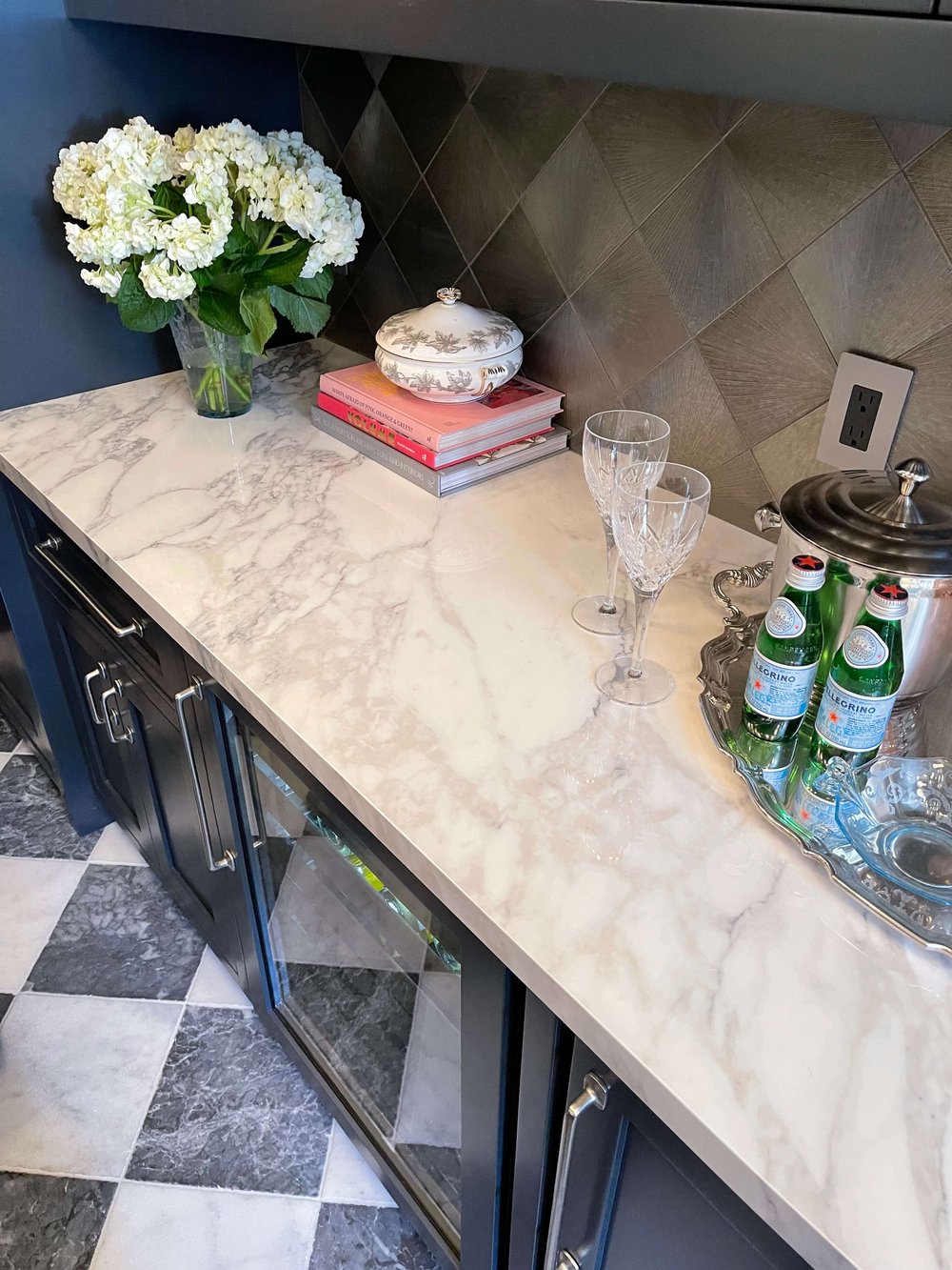
The butler’s pantry dazzled, designed by Jeanne Chung of Cozy, Stylish, Chic, Pasadena Showcase House of Design.
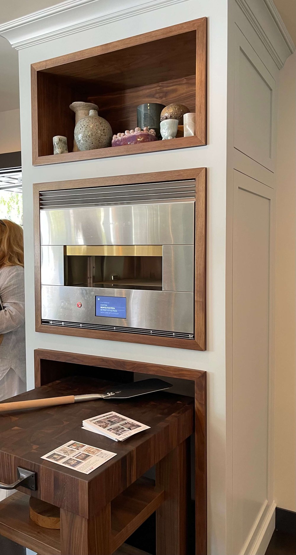
Monogram Appliances’ hearth oven was built in to the space designed by Jeanne Chung of Cozy, Stylish, Chic, Pasadena Showcase House of Design.
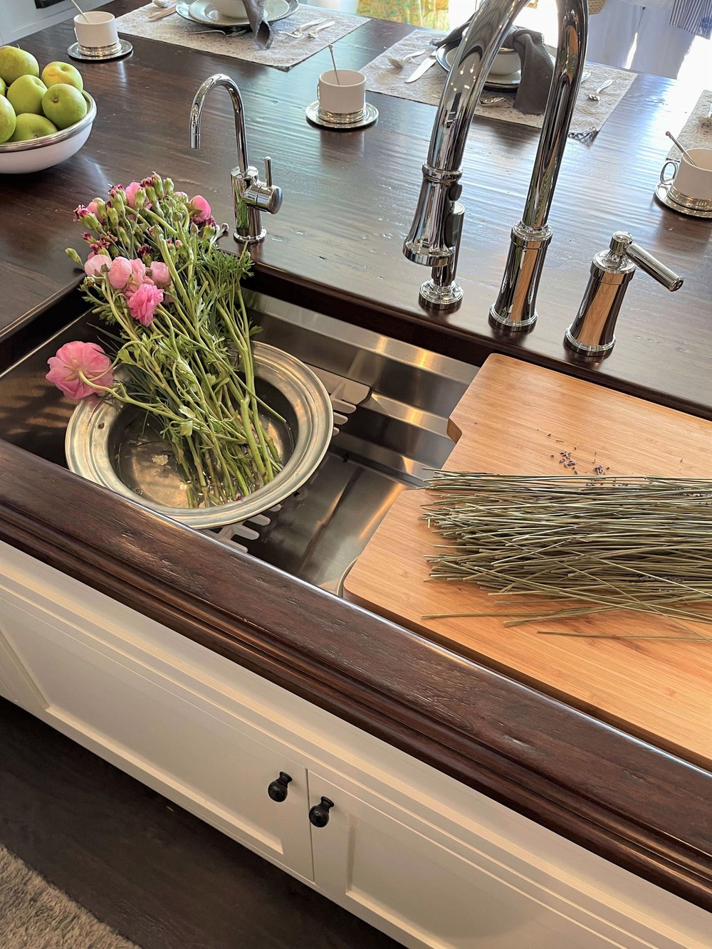
A workstation sink in the beautiful island of the kitchen, designed by Jeanne Chung of Cozy, Stylish, Chic, Pasadena Showcase House of Design.
The showcase home is open until May 22, 2022, so you still have time to visit! You can find out more and get your tickets here. :-) I highly recommend!
Look for my post on the second floor and cabana in Part 2, later this next week. :-)
Designers and Realtors:
Do you like the quality of my photos above? These were all done with my iPhone while doing this tour. After learning so much about taking interiors photographs from my designer/photographer friend, Linda Holt, I am really confident in my shooting and even some photo editing done after the fact.
Want to learn more about her course? See how this expertise got me out of a pickle HERE.

